srcset img Attribute and Responsive Images
Table of Contents
Top-level perspective
Different devices (desktop, mobile, laptop) means- Different screen width/height
- Different resolutions for the same screen width, maybe: 1x,2x,3x
These conditions create two challenges
- Ux: you want the UI to look good; in particular you don't want images to look distorted (wrong aspect ratio, not enough pixels)
- Performance: no need to download big images when it is not needed
The solution to these challenges is responsive design.
In this article, we will concentrate on responsive images, which allow us to download different image files for the same img element given different device dimensions and resolution
What is a responsive image?
- Responsive images work well on devices with widely differing screen sizes(width, height), and resolution
- The goal of the responsive image is to serve the right image to the right screen size and device (including desktops, laptops, tablets, and smartphones) to avoid downloading unnecessary large images on a smaller device
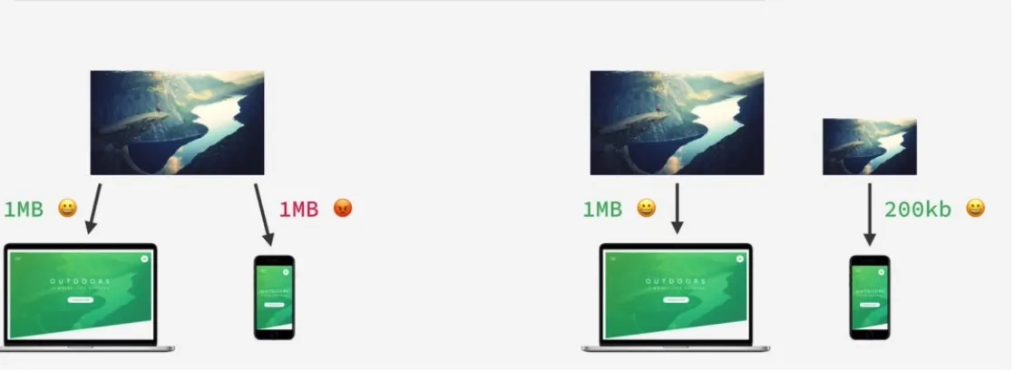
- Responsive image plays an important role in web performance
- Responsive image is part of responsive design
Important definitions
o implement responsive images effectively, it is essential to distinguish between the physical properties of a screen and how the browser interprets those pixels.Display size
Display size refers to the physical dimensions of a screen, typically measured diagonally from one corner to the opposite corner. It is common to express display size in inches
Often, people specify the display size as the diagonal size, such as 15 inches for PCs, 27 inches for PCs, 5.5 inches for mobile phones, etc
Display resolution
Resolution refers to the number of pixels on the display's screen. It is expressed as the total number of pixels in width by the total number of pixels in height. Commonly, the resolution is given as width x height (e.g., 1920x1080)
Pixel Density \ Pixels Per Inch (PPI)
Pixel density indicates the number of pixels per inch (PPI) on a display. The higher the pixel density, the more detailed the picture is
In short, pixel density is the ratio between a screen’s size and its resolution
For instance, the standard 1920×1080 Full HD resolution will result in a different pixel density (or pixels per inch) on a 24″ screen (92 PPI) and a 27″ screen (82 PPI).
1x , 2x , 3x screen resolution
The terms "1x," "2x," and "3x" are used in the context of screen resolutions, particularly concerning images displayed on screens with different pixel densities. These terms are often associated with the srcset attribute in HTML, where they help define different versions of an image for different screen resolutions.Notice that in the following figure, the same physical space is occupied by 1 pixel for a 1x screen, 4 pixels for a 2x screen, and 9 pixels for a 3x screen.
1x
Definition: 1x, or "baseline," refers to the standard pixel density or resolution. In the context of images, this typically corresponds to a display with a standard pixel density, where one device pixel is equivalent to one CSS pixel
Use Case: Images marked with 1x are intended for devices with a standard or baseline pixel density
2x
2x, or "retina" or "high-density," indicates a screen with a pixel density roughly twice that of the baseline. 2x is often applied to devices with high-resolution displays, such as Retina displays on Apple devices
Use Case: Images marked with 2x are higher-resolution versions designed for devices with higher pixel densities to ensure sharp and clear visuals
3x
Definition: 3x signifies an even higher pixel density, approximately three times that of the baseline. 3x is used for devices with extremely high-resolution screens
Use Case: Images marked with 3x are meant for devices with very high pixel densities, such as certain newer smartphones with ultra-high-definition displays
When to use responsive images
Responsive image use cases :-
Resolution switching - Different sizes
Depending on the device, we want to display identical image content, just larger or smaller
Check this sample code resolution switching and sample code resolution switching with sizes
-
Density switching - Same size, different resolutions
Suppose you're supporting multiple display resolutions, but everyone sees your image at the same real-world size on the screen. In that case, you can allow the browser to choose an appropriate resolution image using srcset with x-descriptors and without sizes — a somewhat easier syntax!Density switching is a particular case of resolution-switching
1x screen refers to a low-resolution screen, 2x screen refers to a high-resolution screen
check this sample code
-
Art direction - change the image displayed to suit different image display sizes
Serve cropped images or smaller images for smaller screens. Picture element is used herePicture element is part of responsive images and supports srcset, but so I do not provide a sample code in this post
What is srcset attribute
srcset is part of a responsive image. It is an attribute of img. Most developers need to be aware of this attribute and use it
srcset defines the set of images we will allow the browser to choose between and what size each image is. Each image information set is separated from the previous one by a comma. For each one, we write:
- An image filename (e.g. elva-fairy-480w.jpg or pic-1600w.png)
- A space
- The image's intrinsic width in pixels (e.g., 480w) — note that this uses the w unit, not px, as expected. You can find an image's intrinsic size, which is its actual size, by inspecting the details of the image file on your computer.
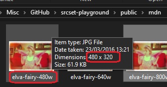
Code sample - resolution switching
The following example demonstrates how to implement resolution switching by providing the browser with a list of image sources and their corresponding intrinsic widths.Source code
index-use-case1.html<img
style="width: 100vw"
src="pic-1600w.png"
alt="responsive image use case 1 - resolution switching without sizes"
srcset="pic-1600w.png 1600w, pic-800w.png 800w, pic-600w.png 600w"
/>
The browser will typically base its decision for the appropriate image file on the device's pixel density (DPR) and the available width of the viewport
Notice that this algorithm is intelligent: if the viewport width is large, it fits the large picture for better UX. But if the viewport width is small, the UX will also be good enough with a smaller-width image. When the browser downloads a smaller image faster, it improves performance, especially regarding LCP (Largest Contentful Paint).
Check the figs to get a better feelingPerformance and file size
These are the file sizes- pic-1600w.png - 27.1kb
- pic-800w.png - 8.92kb
- pic-600w.png - 6.55kb
Notice that pic-600w.png file is x4 lighter than pic-1600w.png, so the download time is four times quicker, improving the performance. You can use Page Speed Insight for performance in general and LCP in particular
Figs
You can see very nicely how the srcset algorithm fits the best image file based on the viewport widthPC : viewport width 1173px --> pic-1600w.png is used
PC : viewport width 791px --> pic-1600w.png is used
PC : viewport width 674px --> pic-800w.png is used
PC : viewport width 445px --> pic-600w.png is used
Mobile : The viewport width is 360, and the device pixel ratio is 2, so we use pic-800w.png. Notice that the device pixel ratio is 2, i.e., every image file pixel is represented by the mobile device screen by 2 pixels. So we have here 360*2 pixels, which seems appropriate for the pic-800w.png image
Code sample - density switching
This implementation focuses on serving higher-resolution assets based on the device's pixel ratio, rather than the viewport width, using the simplified x-descriptor syntaxSource code
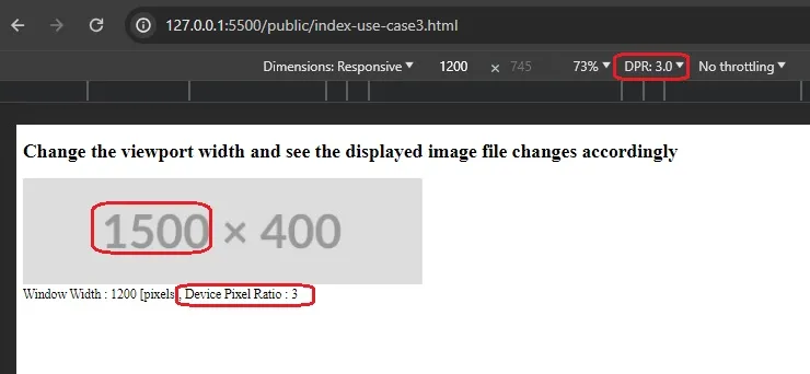
<img
  src="pic-1500w.png"
  alt="responsive image use case 3 - use density switching (no sizes)"
  srcset="pic-1500w.png 3x, pic-1000w.png 2x, pic-500w.png 1x"
/>
Figs
You can see very nicely how the srcset algorithm fits the best image file based on the pixel density of the screen device. The device with the most pixel density - 3x was matched with the file with the most pixels desktop-use-case3-3x.jpgFit desktop-use-case3-1x.jpg for 1x device screen
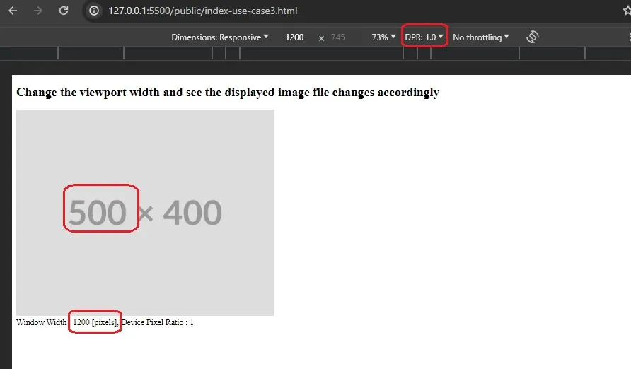
Fit desktop-use-case3-2x.jpg for 2x device screen
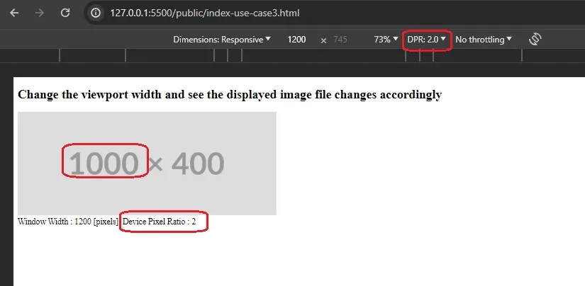
Fit desktop-use-case3-3x.jpj for 3x device screen
srcset vs media query
While media queries are excellent for adjusting the layout and styles based on the viewport, srcset specifically addresses the challenges related to delivering appropriately sized and resolution-specific images
Combining both allows for a comprehensive approach to responsive web design
Furthermore, it is not possible to use different image files for a given img element using a media query; It is possible by using srcset!
What is sizes attribute
While srcset provides the browser with a list of available image files, the sizes attribute tells the browser exactly how much space those images will occupy on the screen at different breakpoints.
Definition
sizes define a set of media conditions (e.g., screen widths) and indicate the best image size to choose when certain media conditions are true. In this case, before each comma, we write
- A media condition (e.g. (max-width:600px)) — let's just say that a media condition describes a possible state that the screen can be in. In this case, we are saying "when the viewport width is 600 pixels or less"
- A space
- The width of the slot the image will fill when the media condition is true (480px)
Code sample - resolution switching with sizes
When you don't specify the sizes, the default is 100vw, meaning the image file will choose to match the whole viewport. What if the image occupies half the viewport? in this case, you want the browser to choose the appropriate image file to fit into half the viewport size, and you can do it using sizes as shown below
Source code
index-use-case2.html<img
style="width: 50vw"
src="pic-1600w.png"
alt="responsive image use case 2 - resolution switching with sizes"
sizes="50vw"
srcset="pic-1600w.png 1600w, pic-800w.png 800w, pic-600w.png 600w"
/>
Figs
The viewport width is 1280; the image occupies half, thus 640px, so the browser fits the image file with a width of 800px

The viewport width is 1200; the image occupies half, thus 600px, so the browser fits the image file with a width of 600px

How to emulate screen resolution (1x, 2x etc)
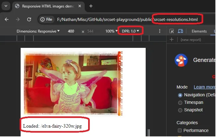
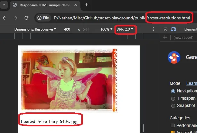
1x, 2x, and 3x are also called device pixel ratios. For 1x screen resolution, each pixel has a pixel in hardware(device screen). for 2x screen resolution, each pixel has two pixels in hardware
To emulate this in Chrome, check Chrome documentation
Emulate 1x device screen resolution in Chrome dev tools
Emulate 2x device screen resolution in Chrome dev tools
Repository
Check the readme in responsive-image-using-srcset-playground (tag 0.3)References
- Responsive Images , mdn
- 'Advanced CSS and Sass: Flexbox, Grid, Animations and More!' , Jonas Schmedtmann
- responsive-images, mdn github repository
- 'What Is Pixel Density And Pixels Per Inch (PPI)?' , Rob Shafer , Feb 2023
- 'Make Your Site Lightning Fast With Responsive Images' , WDS , June 2023
- ' srcset and sizes attributes - [ images on the web | part one ] ' , Kevin Powell , Dec 2018